Mobile - First time use
Problem
Customers often don’t know what features are available so we set out to be more conversational around the functionality and benefits of the app and to inform customers contextually about features and benefits.
Approach
We started with auditing and categorizing the intro and review screens to take a holistic view. This allowed us to define an E2E strategy and documenting guidelines for information hierarchy and design. We aimed to reinforce trust through cohesive messaging and information design and allow many writers to execute on narrative, messaging, and information design across different product domains. We measured success through flow conversion, drop-off rates, and customer contacts.
My role
In collaboration with my UX design lead, I defined and documented the strategy for information and messaging hierarchy for first time use, intro screens, and success screens (included below). I wrote the copy for several screens across app experience, including the screens shown below.

Onboarding success
After signing up, this screen does a few important things. It helps guide people to the next best step for them, it educates about app features and benefits, it gives a heads up about what tasks are available from the Home screen, and it captures customer intent data (helpful for future improvements for the onboarding experience).

Balance intro
If you don't have money in your account and you click into the balance section for the first time, you'll see this screen. Historically, we've seen problems with customer comprehension around balance, so this educates that you can send and spend without a balance. It also sets up the next best action - linking a bank or card - as a way to hep you get started.

Banks and cards intro
Here, I'm using "one safe place" to explain the "why" and to respond to the hesitation that newer customers feel when linking a bank or card. This is also a good opportunity to let people know they'll still get reward points when using PayPal, since we commonly hear from customers that rewards points is often why they choose a card over PayPal at checkout.

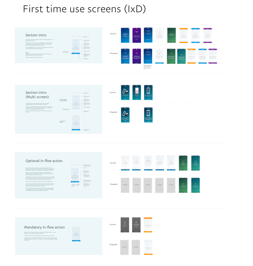
Strategy and guidelines
This shows the audit and E2E view of our screens. It's also where we defined the purpose of each type of screen, information design, messaging hierarchy and guidelines to promote cohesiveness across multiple writers and designers working on the app.